Thouvenin
Portraying a sharp and far-sighted law firm
At the age of 40, Thouvenin is looking ahead: We shortened the brand from “Thouvenin Rechtsanwälte” to just “Thouvenin” making it language-independent, easier to use in digital applications and helping with the firm’s international audiences. The design became fresher and bolder. The highly differentiating brand imagery created with drone video and drone photography creates a very sharp and contemporary expression. The new look fits the entrepreneurial approach that always set the law firm apart.


“Today, most law firms understand the value of a contemporary visual identity and differentiating design. So we had to raise our game. Thanks to the expertise and design skills of Scholtysik we live up to our audiences’ as well as our own expectations.”
Rolf Schuler, Partner at Thouvenin
“Zurich Birdview”
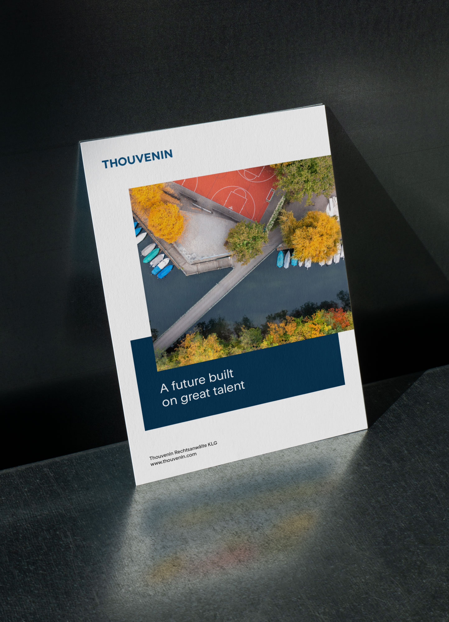
The perfectly vertical drone view is fascinating. It embodies the analytical clarity, the entrepreneurial vision and the local roots of the Zurich-based law firm.
The analytical clarity of carefully composed drone video and drone photography from the greater Zurich area is the most eye-catching and unique element in Thouvenin’s visual identity. On Google Maps we identified interesting locations, then checked for best day or night times for ideal lighting conditions. All shots were done simultaneously for moving and static images. We had developed the “Zurich-Birdview” concept several years ago which increased the law firm’s awareness and recognition significantly.
A clear and functional website
The new website is structured in a very clear way and allows users to easily navigate through Thouvenin’s news, lawyers’ profiles, practice groups and publications. The UI design is simple and clean. The generous use of white space makes the spectacular “Zurich-Birdview” photography stand out even more. The brand imagery forms the dominant design feature and runs as a common thread through the simple and clear website.
More impact in non-digital communication
The clear design language and low-threshold access to information is also continued beyond the website. High-quality business stationery, a large set of office templates, a concise advertising concept and other print products are seamlessly integrated.
Simple and robust building blocks
The brand design focuses on clear type, active colours and consistent reduction to the essentials. The system has proven simple and robust in all kind of applications. Within the very brief and compact social media formats the new design increased visibility and impact significantly.
Our services
Logo design | Brand design | Naming | Image concept | Drone photography | Website | User experience design | User Interface design | Collateral | Stationery | Office templates | Ad concept | Social media assets