ETH Zurich
Structure and Freedom
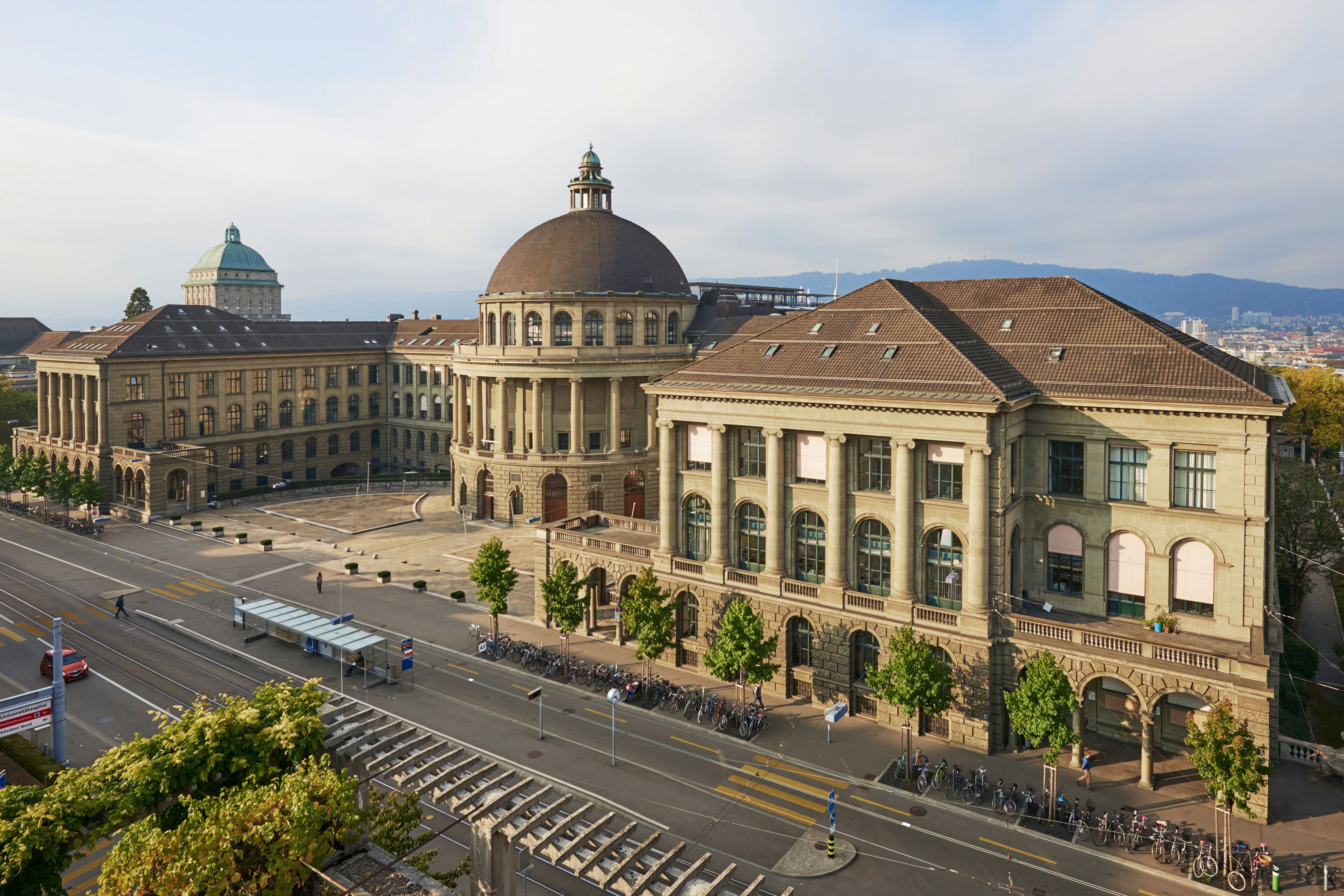
The Swiss Federal Institute of Technology, ETH Zurich, is the best ranked technical university in Europe and one of the best in the world. It is also a highly complex organisation consisting of 16 departments and several hundred institutes, labs, collections and chairs.
Freedom and individual responsibility drive the ETH spirit. Accordingly, all the organisational units act freely and independently. At the same time they require a powerful umbrella brand that attracts top scientists and talents from around the world. So, the task at hand is to establish ETH as a powerful science brand on the global stage while creating space for a varied and highly dynamic organisation.


Strong ETH presence and clear sender identification
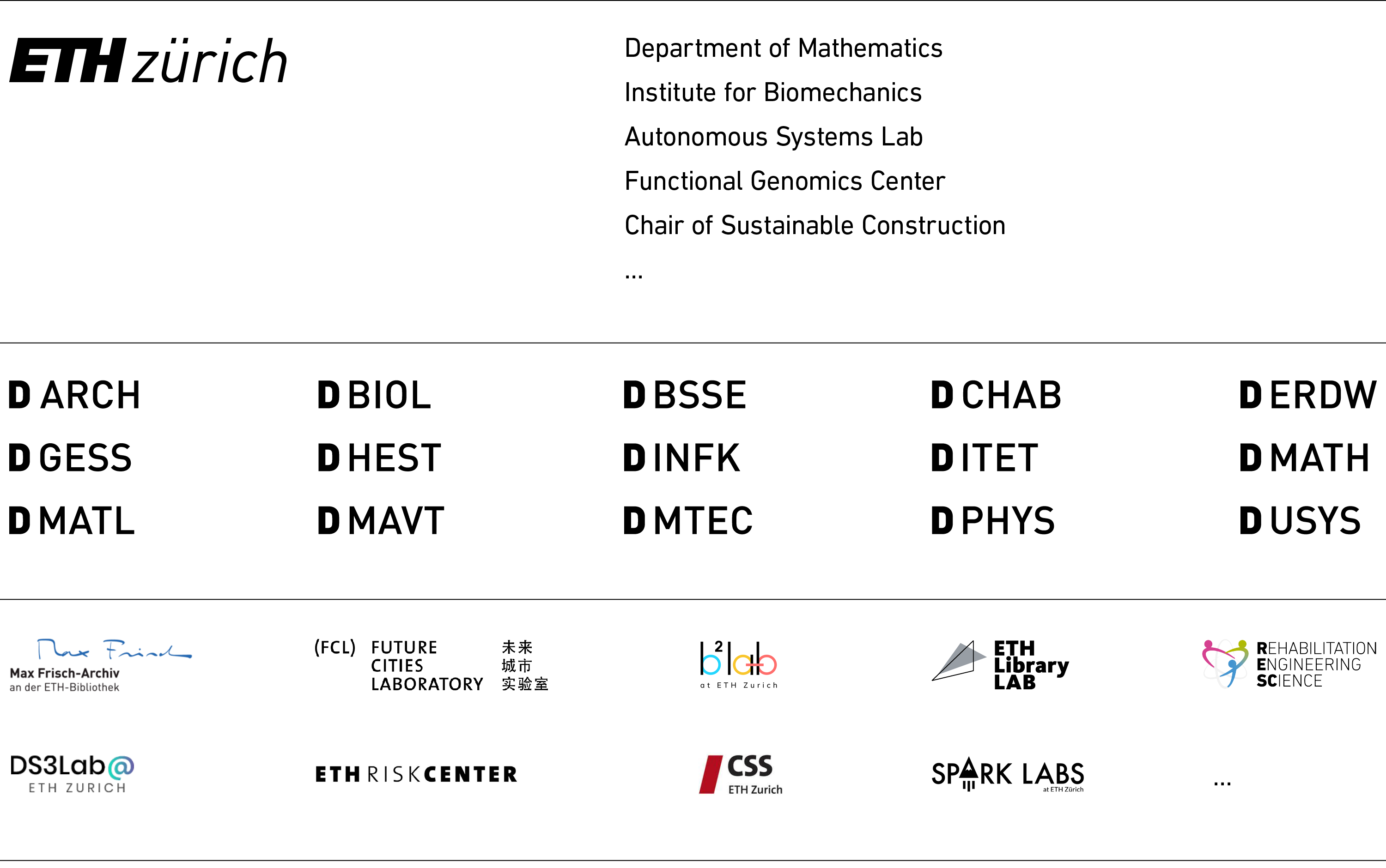
At the Swiss Federal Institute of Technology, hundreds of different senders are communicating to various audiences using nearly as many logos. The departments have unified department logos using their technical abbreviations which is especially relevant for internal communication purposes. All other units such as institutes, competence centres, labs, collections, research groups or chairs are free to maintain their own logos.
A uniform sender identification with defined co-branding options makes clear who is communicating in each instance. Furthermore, it creates space for additional logos of the respective unit. The fixed and prominent placement of the ETH logo holds all publications together under their common umbrella of the Swiss Federal Institute of Technology.
The sender identification is adaptable to university partnerships where ETH Zurich communicates alongside other universities, e.g. the University of Zurich.

Strict framework and free content
The idea is simple: The ETH logo and the individual sender, all black-and-white, constitute a neutral and consistent frame. Within which all the various disciplines, contents and ways of thinking unfold at liberty. Imagery is completely free: whatever you can visualize.
The variable, overlapping labels kill two birds with one stone: First, we enable all users, even complete beginners, to pragmatically place their headlines on pictures with perfect legibility. Second, we continue the established ETH design feature of overlapping colour fields and maintain recognition. Just in a simpler and more flexible way.
For even more continuity, we keep the existing ETH colour palette and very softly update the corporate font DIN to the more recent DIN Next. The successor is optimized for use in copy and provides more compact typesetting as well as higher reading speed.
Adaptation ensures long-term effect
The most often-used academic media are presentations and scientific posters. Then there are more than 570 websites containing some 80.000 pages and a vast amount of print publications, posters, screens and event collateral. The variable and robust ETH identity is designed to adapt to all kind of requirements without loosing its character and recognition across the various communication channels.
“We made the ETH design more modern, simpler and more variable. And yet we kept many time-tested assets and thus maintained continuity. The redesign proved very popular with our diverse users and we are very happy with it.”
Dr. Nicole Kasielke, Head Communication Channels, ETH Zurich
The ETH website(s)
The central ETH website consists of some 7.700 pages. Several hundred more sites use the same CMS with the same templates. Specific requirements such as a prominent and smart search function, deep navigation structure or modular page layout have been considered during the corporate design development. Design changes will be implemented step-by-step over a two-year period. Interim stages already employ several features of the new ETH design. See the current state here: ethz.ch
Black on white
The layout framework including the ETH logo is always black-and-white. It provides a neutral background for individual colour moods and imagery. Thus, we bring the traditionally black-and-white office world together with the more colourful universe of publications, events and marketing communications. For the first time at ETH, these two build a truly unified visual identity.
Our services
CD analysis | Brand architecture | Sender identification and co-branding | Corporate design | Brochure concept | Presentations | App icon system | Online guidelines | Best-practice examples | Template libraries | Adaptation of special cases